| CONTENT | REFERENCES | RESOURCES | SPONSORS | CONTRIBUTORS | HOW TO USE THIS CD |
| CLIMATE CHANGE IN CONTEXT | PREVIOUS | | | NEXT |
4.1.d Paleo-proxy Data and Trends in Temperature
How do scientists determine the temperature of the earth before there were thermometers? Before people recorded data? Before the last Ice Age? They use evidence from environmental sources which can give indirect evidence of the climate of the past and so it is called “proxy” data. High-resolution proxy climate indicators such as tree rings, corals, ice cores, and laminated lake/ocean sediments, can be used to provide detailed information on annual or near-annual climate variations back in time. Certain coarser resolution proxy information (from e.g., boreholes, glacial moraines, and non-laminated ocean sediment records) can usefully supplement this high-resolution information. Scientists then calibrate this proxy evidence against thermometer data and use it to estimate climatic conditions beyond the 100-year instrumental record. This way scientists can establish how variable Earth’s climate was before humans had an influence on a global scale. They can determine the level of human effect on global temperature.
Beginning in the 1970’s, paleoclimatologists began using proxy data to determine how the Earth’s temperature has changed over the centuries before 1850. Now, many more paleoclimate records from around the world are providing a more detailed picture of changes in the Earth’s temperature.
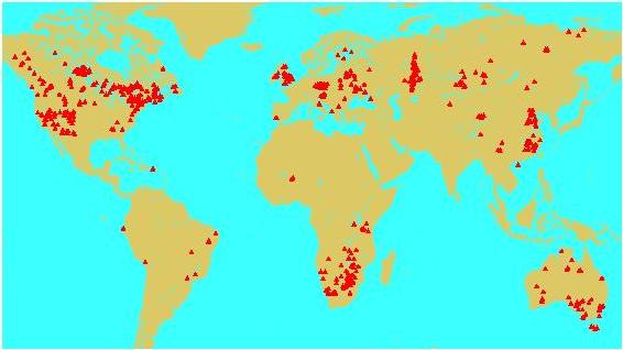
Global temperatures have been reconstructed using data from boreholes drilled into the earth’s surface. The temperature changes with depth are recorded. There are sites with a total of over 600 boreholes, located on all continents except Antarctica. See Figure 1 Location of borehole sites. http://www.ngdc.noaa.gov/paleo/borehole/core.html
Figure 1 Location of borehole sites (Source NOAA complete ref.)

Figure 2. Reconstructed global ground temperature (estimated from borehole data) over the past five centuries relative to the present day. (Source: IPCC WGI Fig. 2.19)
This graph shows the global ground temperature over the past five centuries (estimated from borehole data from 358 sites, mostly in North America and Asia). The thick black line represents the average surface temperature since 1500 compared to the present-day. The shaded area is the likely range for the average. The jagged line is the smoothed (five-year running) average of direct measurements of the global surface air temperature since 1860.
Figure 3 Variations of the Earth’s surface temperature for the past 1000 years (Northern Hemisphere) Source: Climate Change 2002 Synthesis Report, p. 49

This graph of the surface temperature of the Northern Hemisphere combines the proxy data and direct temperature measurements. The blue line is the year-by-year temperature, the purple line is the 50-year average and the grey area is the likely range for the proxy data. The red line represents the direct temperature measurements.
ACTIVITY 1
Examine the two graphs above. What trends do you see? Paleoclimatic studies show that recent years, the 1990s, and the 20th century are all the warmest, on a global basis, of the last 600, and most likely 1200 years.
Figure 4 shows Earth’s temperature for the past 400 000 years, based on ice core data from Antarctica. http://www.grida.no/climate/ipcc_tar/wg1/072.htm
This diagram could also be placed in TOC sections 4.1bc for Paleo-proxy trends in CO2 and other GHG’s.
Figure xxx: Variations of temperature, methane, and atmospheric carbon dioxide concentrations derived from air trapped within ice cores from Antarctica (adapted from Sowers and Bender, 1995; Blunier et al., 1997; Fischer et al., 1999; Petit et al., 1999). (Source: IPCC WGI Fig. 2.22)
Source reference IPCC Climate Change 2001:Working Group I: The Scientific Basis Chpt 2.3.2.1 Online at http://www.grida.no/climate/ipcc_tar/wg1/068.htm


